Wednesday, September 2
Start With the Mood, Not the Season
Before you start choosing colors, think about how you want the room to feel.
Do you want something:
- Warm and romantic
- Moody and dramatic
- Soft and organic
- Modern and sophisticated
- Classic with a subtle fall influence
That decision matters more than simply choosing “fall colors.”
A fall wedding palette can include burgundy, plum, rust, sage, ivory, navy, black, berry tones, warm neutrals, or even clear and metallic accents.
You do not need every traditional autumn shade in the same room.
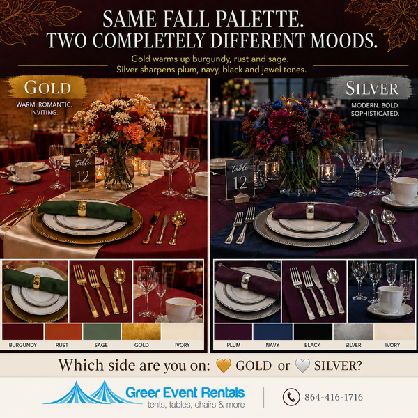
Gold Makes Fall Feel Warm
Gold naturally adds warmth to a tablescape, which makes it a strong choice for rich, romantic fall colors.
Think:
Burgundy + rust + sage + ivory + gold
Burgundy adds depth.
Rust brings in warmth.
Sage keeps the palette grounded and soft.
Ivory lightens the overall look.
Gold brings everything together.
Gold chargers, gold-rimmed plates, metallic flatware, or even small gold accents can make the table feel warmer and more elevated without overwhelming the design.
You do not need gold everywhere.
A few intentional metallic details are usually enough.
Try This Fall Combination
Picture a burgundy linen with an ivory runner, ivory dinnerware, gold accents, and a deep sage napkin.
Add florals with burgundy, rust, cream, and greenery.
The result feels unmistakably fall, but it does not look themed.
That is the difference between decorating for a season and designing a space.
Silver Creates a Completely Different Mood
Now take those same deeper fall tones and shift the metal.
Think:
Plum + navy + black + ivory + silver
The overall feel becomes cooler, sharper, and more modern.
Silver works especially well with jewel tones because it creates contrast instead of adding more warmth.
A silver charger paired with ivory dinnerware, silver flatware, and a plum or navy napkin creates a completely different atmosphere from a gold table.
Same season.
Different mood.
That is why the finishing details matter so much.
Your Place Setting Is Part of the Color Palette
When people plan a wedding palette, they often focus almost entirely on linens and flowers.
But your guests spend a lot of time looking directly at the table in front of them.
The dinnerware, charger, glassware, napkin, and flatware all become part of the visual experience.
At Greer Event Rentals, options such as white plates, gold-rim ivory plates, clear plates, and chargers can help shape the look of the table.
A white plate can feel clean and classic.
A gold-rimmed ivory plate adds warmth and formality.
A clear plate allows the charger or linen beneath it to become part of the design.
One place setting may seem like a small detail.
Repeat that place setting across an entire reception, and it becomes a major part of the room.
Texture Matters Just as Much as Color
One of the easiest ways to make a fall wedding feel more layered is to add texture instead of simply adding more colors.
Consider combining elements such as:
- Textured linens
- Metallic chargers
- Glassware
- Cloth napkins
- Wood accents
- Greenery
- Candlelight
- Clear acrylic or glass details
A restrained palette with several textures often feels much more polished than a table trying to use too many competing colors.
Give Every Color a Job
One of the easiest ways to keep a palette from becoming chaotic is to decide what role each color will play.
For example:
Burgundy: primary linen
Ivory: runner and dinnerware
Sage: napkins and greenery
Rust: floral accents
Gold: charger, flatware, and finishing details
Now compare that with:
Navy or black: primary linen
Ivory: dinnerware
Plum: napkins and florals
Berry tones: accent color
Silver: charger and flatware
Both work beautifully for fall.
They just create very different experiences.
Do Not Forget the Room Around the Table
Your color palette should not stop at the place setting.
Think about how the table will interact with the rest of the event.
Consider:
- Chair color and style
- Table shape
- Linen length
- Dance floor
- Tent interior
- Lighting
- Bar setup
- Catering tables
- Dessert displays
- Florals
- Signage
If your reception is under a tent, for example, a warm burgundy-and-gold palette may feel completely different under soft lighting than it does in a bright daytime setting.
The room should feel connected from one area to the next.
See the Pieces Together Before the Wedding
Inspiration photos are helpful, but screens can be deceiving.
Two colors that look perfect together online may look completely different once you see the actual linens, plates, chargers, and accessories side by side.
That is why it helps to look at the pieces together before finalizing your rentals.
Bring your inspiration photos, wedding colors, floral ideas, and any other design references you already have.
Seeing everything together can help you spot combinations you might not have considered.
It can also help you avoid discovering on wedding day that two shades you thought matched do not actually work well together.
Fall Wedding Colors Do Not Have to Be Predictable
Maybe your wedding is burgundy and gold.
Maybe it is plum and silver.
Maybe it is sage, ivory, and warm wood tones.
Maybe you choose one deep seasonal color and pair it with something completely unexpected.
The best fall wedding palette is not the one that looks the most like fall.
It is the one that creates the atmosphere you want your guests to experience.
Planning a Fall Wedding in the Upstate?
Greer Event Rentals can help bring your palette together with plates, chargers, linens, flatware, glassware, tables, chairs, tents, and other event rental pieces.
Serving weddings and events throughout Greer, Greenville, Spartanburg, and the Upstate South Carolina area.
Schedule your color palette consultation:
864-416-1716
Visit GreerEventRentals.com to explore rental options and start planning your event.
<< Back | View All Articles >>